A well-organized navigation menu is crucial for any website. It acts as a roadmap, guiding visitors to the information they seek. WordPress makes creating and managing menus a breeze, even for beginners.
This simplified guide will walk you through the step-by-step process of how to add a navigation menu in WordPress.
Table of Contents
What is a Navigation Menu?
The navigation menu, typically located at the top or header of your website, displays links to important pages and sections. It often includes categories such as Home, About Us, Products or Services, Contact, and dropdown menus for subcategories, or additional navigation options.
The navigation menu helps visitors navigate your website intuitively and find the content they’re interested in.
How to Add a Navigation Menu in WordPress: 2 Simple Methods
Creating a navigation menu comes in 2 ways — through Elementor and directly in the Gutenberg WordPress block editor.
But how?
Introducing, ElementsKit Menu Module and Navigation Menu Block of GutenKit. These 2 meet your expectations when it comes to user interface and customizations. They both offer functionalities to tailor a navigation menu specifically designed for mobile devices.
If you are an Elementor user, ElementsKit is the perfect solution for creating a custom navigation menu. Whereas, you can use GutenKit if you are comfortable with Gutenberg. But to get started, you should install ElementsKit and GutenKit into your website.
Take a deep breath as we will take you on a journey of discovering the simple steps in adding your custom navigation menu in WordPress.
How to Add a Navigation Menu in WordPress Using a Page Builder
Page builders like ElementsKit offer a powerful and visual way to create and customize navigation menus on your WordPress website. Like many page builders, ElementsKit requires Elementor, so make sure that you have the Elementor installed in your WordPress site.
Here’s how ElementsKit works:
Step 1: Setting Up your Navigation Menu Plugin
The world of technology is stretching into a vast ocean of possibilities. So everything is simplified just like creating a navigation menu.
So let’s get started………
➡️ In your dashboard, locate ElementsKit and open Module.
➡️ Enable Header Footer Builder and save changes.
➡️ Go back to ElementsKit and click Header Footer to start creating your custom navigation menu.
Step 2: Assigning Menus to Locations
After you set up the ElementsKit, it’s time to decide where the menu will appear on your website. Most themes offer common menu locations like header, footer, or sidebar.
After you click on the Header Footer, you will be directed to a page where you can choose the location of your menu item. With ElementsKit, you have the option to display your menu either in the header or footer of your page or you can do both.
Once you have decided the location of your menu, you can now add your menu item.
Step 3: Adding Menu Items
After you determine the location where you want your navigation menu to be visible, it’s about time to start adding your nav menu.
By clicking “Add New” as shown in the above picture, you will be directed to a template settings.
➡️ Complete the 3 parameters:
- Title- Type a name for the template
- Type- Header
- Conditions- Entire Site
➡️ Enable “Activate Button”.
➡️ Click “Edit With Elementor“.
➡️ In the search bar, search for ElementsKit Nav Menu, then drag and drop it and start customizing your menu.


How to Add a Navigation Menu in WordPress Block Editor
The WordPress block editor itself empowers you to create and customize navigation menus directly within your website’s interface.
So let’s find out how amazing the Navigation Menu Block of GutenKit is!
Step 1: Setting Up your Navigation Menu Block
The steps are so easy with the Navigation Menu Block of GutenKit. It provides a powerful solution for effortlessly incorporating and personalizing menus and submenu items within the Gutenberg editor. It is a drag-and-drop block, which makes it very user-friendly.
➡️ Start by opening a new page or opening your existing page.
➡️ Enable the block editor and find the “+” icon at the top of the editor screen.
➡️ Click the icon to open the block library.
➡️ Look for the “GutenKit Nav Menu” and click or drag & drop the block in the editor screen.
Step 2: Adding Menu Items
Once you’ve added the Nav menu block to the editor screen, it will promptly display all published pages as navigation menu items. Additionally, a ” +” icon is available for adding new menu items.
When delving into this block’s settings, you’ll notice it offers more functions compared to other GutenKit blocks. Simply click on a navigation item on the editor screen, and its settings control will emerge in the right sidebar.
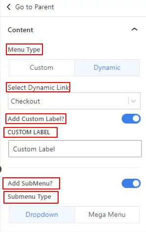
➡️ In the Content section, you will see these different parameters:
- Menu Type: Consists of Custom and Dynamic.
- Select Dynamic Link: It is the page where you want to link your menu item from the dropdown.
- Add Custom Label: Toggle the button to add a different label for the menu item. In the Custom Label field, enter your custom text.
- Add SubMenu: Switch on the button to activate the sub-menu feature. This action prompts a “+” icon to appear below the menu item on the editor screen. Additionally, a new option titled “Submenu Indicator” will become visible in the setting area.
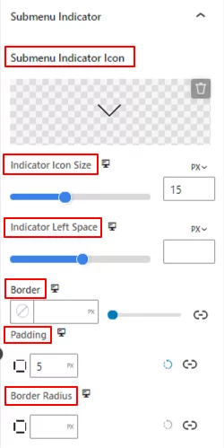
- Submenu indicator Icon: Select an icon from the library or upload your SVG file as the submenu indicator icon.
- Indicator Icon Size: Use the slider to define the size of the submenu indicator icon.
- Indicator Left Space: Adjust the gap between the menu name and icon using this slider.
- Border: Give a border around the icon and select its color, style, and thickness.
- Padding: Add inner space within the icon border.
- Border Radius: Set the roundness of the icon border.
➡️ How can you add a sub-menu item?
Just like with the menu item, clicking on the sub-menu item will reveal its settings in the right sidebar.
- Menu Type: Select between custom and dynamic menu types.
- Menu Label: Input the desired name for your menu.
- Menu Link: Paste the link you wish to direct visitors to.
- Add Sub Menu: Activate this option to include another menu item beneath the submenu. This will also trigger the appearance of the “Submenu Indicator” icon as before.
Next, let’s dive into the parent settings of a menu or submenu item. To proceed, simply select the “Go to Parent” option from the menu or submenu settings. However, it’s important to note that menus and submenus have distinct functions.
If you select the “Go to Parent” option from a Menu item, you will be directed to the global block settings, encompassing Content, Style, and Advanced options.
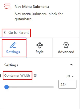
Whereas, the “Go to Parent” option from a submenu item will lead you to the various customization options tailored specifically for submenus within the Settings & Style tabs.
How to Customize a Navigation Menu
The level of customization you can achieve depends on the plugins you’re using. Here are two common approaches:
Customizing a Navigation Menu With a Page Builder
Many popular WordPress page builders like ElementsKIt allow extensive customization of navigation menus. You can often change colors, fonts, layouts, and even add icons to menu items.
To customize your menu item with ElementsKit, simply go to the Menu Settings. In the settings, you’ll find the parameters as shown in the below image.

If you are using the Pro version, you will have the Dropdown Indicator Icon feature instead of the Submenu Indicator option.
Let’s witness how the Dropdown Indicator Icon works:
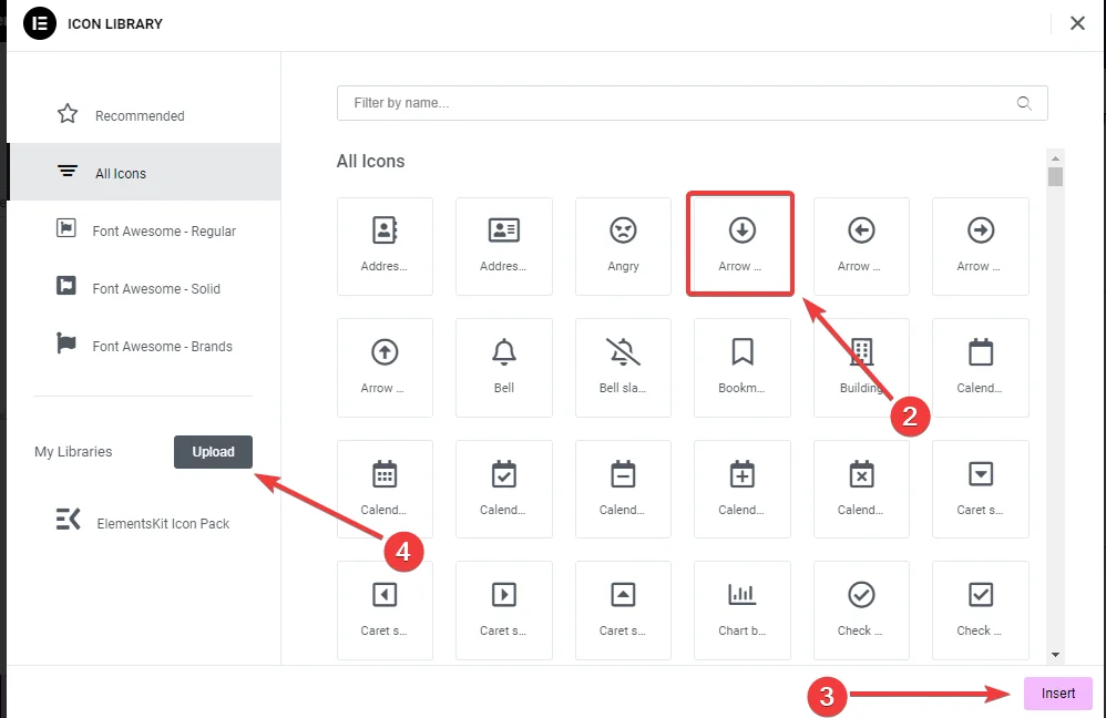
➡️ Click on the icon in the sidebar under Dropdown Indicator Icon.
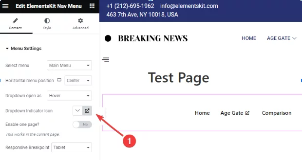
➡️ Click on the pop-up to open the icon library and select the dropdown icon to insert it.
➡️ One way to add the icon is simply by clicking the Upload button to open the Elementor Custom Icon settings.
- If you want to enable one page to display your menu item on the current page, toggle to Yes.
- Select from the Tablet or Mobile option as your responsive breakpoint.
Here’s how it functions when you select the mobile and tablet responsive breakpoint:
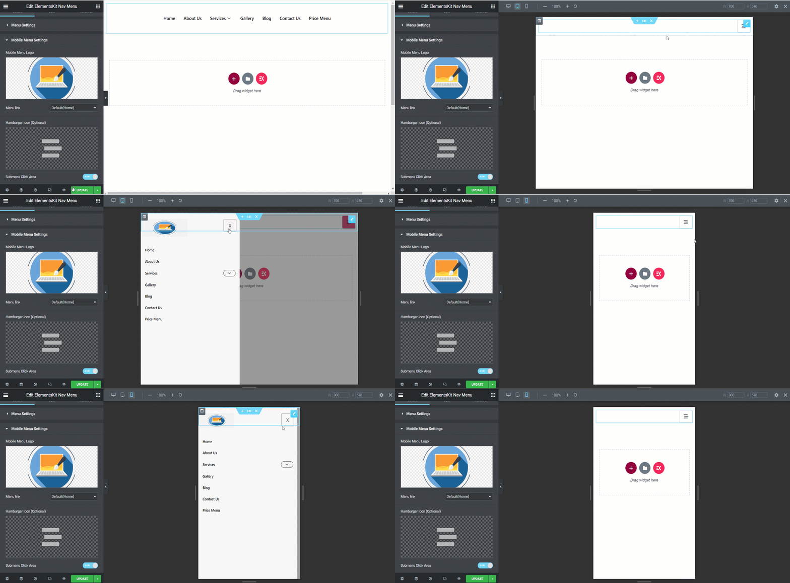
Curious how to create a nav menu for your mobile devices?
Don’t worry! It is so simple!
Go to the Mobile Menu Settings. If you want to insert a certain menu, choose a Custom URL under the Menu Link and paste the link. Visitors will be directed to that link when they click on the logo.
To further enhance the appearance of your menu item according to your preference, simply go to the Style section.
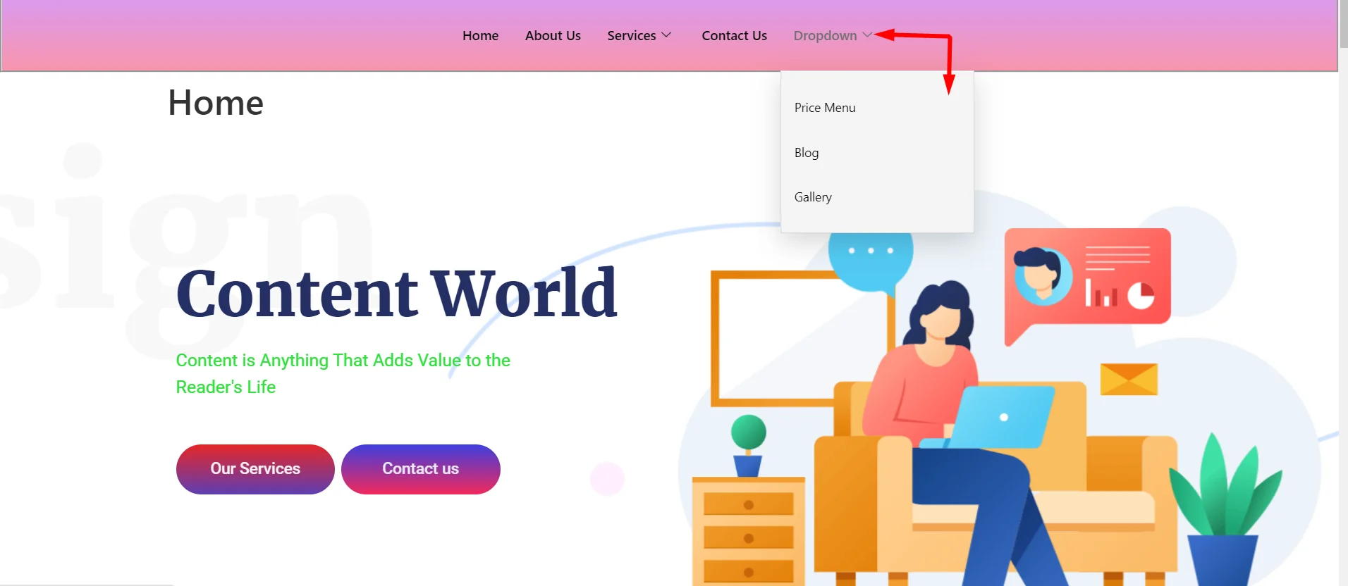
Here is an example of a Nav menu for a desktop view.
Customizing a Navigation Menu With Block Editor
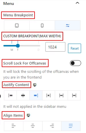
With the GutenKit Nav Menu, you can customize the appearance of your menu item directly within the editor. Look for the menu block settings, which allow adjustments on the following:
- Choosing the menu breakpoint from mobile and desktop options and deciding its width.
- Scroll lock for offcanvas.
- Menu item text position based on six available options.
- Alignment of nav menu items to various positions.
Now, go to the Style section to fully customize your navigation menu. You can adjust its background, padding, border, spacing, typography, etc.
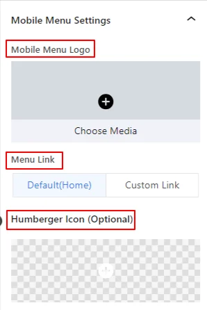
For your mobile devices, look for Mobile Menu Settings to set the logo, add an existing menu link, humberger icon which is optional, and customize the appeal of your mobile nav menu.
Wrapping Up
The steps on how to add a navigation menu in WordPress are really easy. ElementsKit Nav Menu Widget and Nav Menu Block of GutenKit are designed for all types of users — be it a novice or experienced. Both are lightweight, performance-focused, and do not require a code.
Remember, a user-friendly and visually appealing menu can significantly enhance the user experience for your website visitors. So, keep your menus concise, use clear labels, and explore ways to make them visually appealing to match your website’s style.
Don’t hesitate to experiment and find the setup that works best for your website. Explore ElemetsKit and GutenKit for your comfort!
Leave a Reply