Your WordPress website’s navigation menu is like a roadmap! It guides visitors to the content they crave. However, a bland menu can leave them feeling lost.
In that case, properly styling a menu in WordPress can significantly enhance your website’s visual appeal and functionality.
Several accessible ways exist to achieve this. In this write-up, I’ll show 3 beginner-friendly ways to style a menu in WordPress without requiring advanced coding skills. These will help you create a navigation experience that stands out and engages your visitors.
Let’s begin!
Table of Contents
Benefits of Customizing Menu on a WordPress Site
A well-designed menu on your WordPress site goes beyond just good looks. It helps to enhance both the user experience and your site’s overall success. Here’s how a customized menu benefits you:
✅ Intuitive Navigation
A clear and organized menu provides a smooth navigation experience. So visitors can find the information they seek effortlessly. By structuring your menu logically and including relevant links, you can keep visitors engaged and prevent them from getting lost in a maze of pages.
✅ Alignment with Brand Identity
Your website navigation menu is prime real estate for showcasing your brand. Customize its fonts, colors, and layout to match your website’s overall design aesthetic. This consistency reinforces your brand identity and creates a cohesive user experience.
✅ Improved User Engagement and Satisfaction
Adding a well-designed navigation menu in WordPress makes it easy for visitors to find what they need quickly. This reduces frustration and keeps them engaged with your content. A satisfied visitor is more likely to return and explore further.
✅ Boosted Search Engine Visibility and Website Rankings
Search engines consider user experience when ranking websites. An intuitive menu that allows visitors to navigate your site efficiently can indirectly improve your search engine ranking.
How Do I Style a Menu in WordPress: 3 Methods
In this section, we’ll explore 3 effective techniques: using the theme customizer for classic themes, leveraging the full-site editor for block themes, and utilizing a WordPress block plugin (GutenKit).
Let’s dive into each method and see how you can style your website’s menu to better align with your design vision.
Method 1: Styling with Theme Customizer For Classic Themes
If you’re using a classic WordPress theme e.g. GeneratePress, the built-in theme customizer offers a convenient way to style your menu. Here’s how to get started:
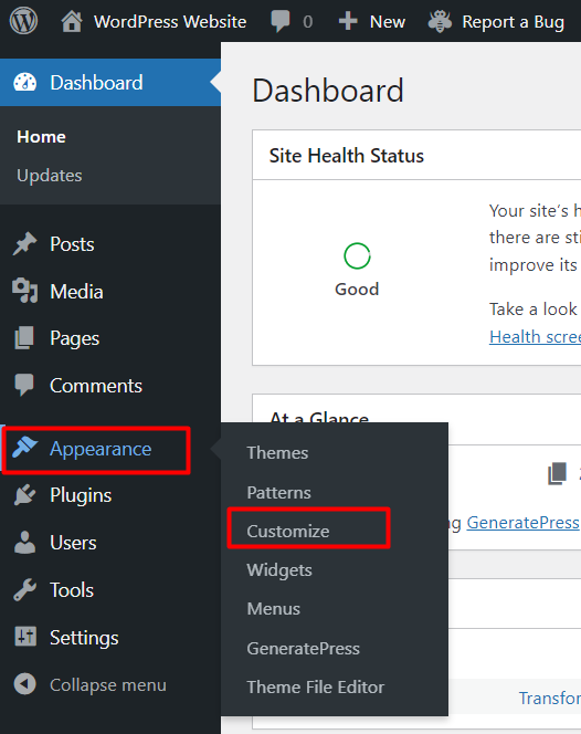
- Log in to your WordPress dashboard, navigate to “Appearance” and select “Customize”.
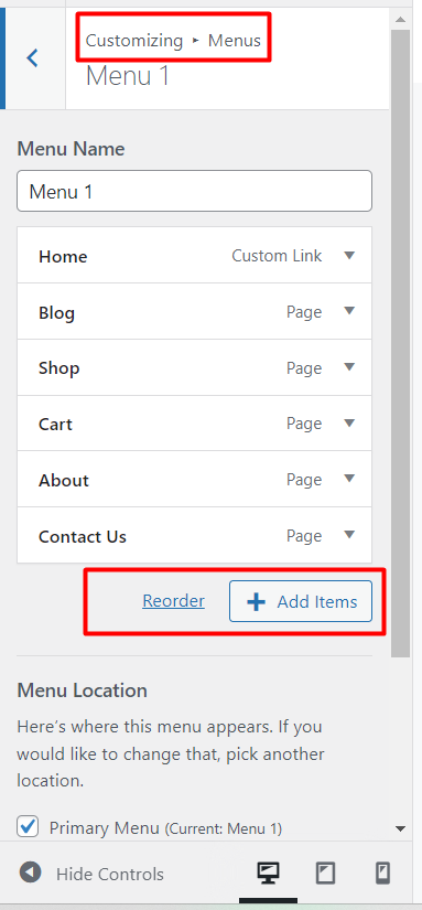
- Within the Theme Customizer, find the section labeled “Menus” This is where you can adjust menu settings such as adding new items, including sub-menu items, editing, deleting items, or swapping their orders.
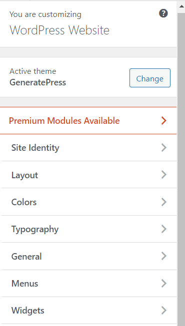
- To style these menu items, you’ll find options for customizing the menu layout, color, typography, and more.
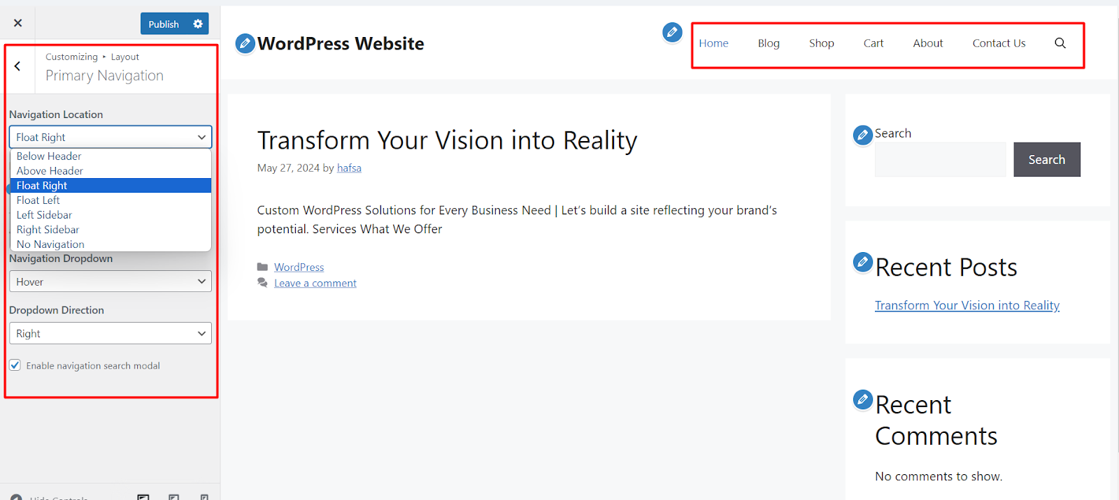
- Navigate the “Layout” setting. Click on “Primary Navigation”. Adjust the navigation menu location of your WordPress website. You can place it below the header, above the header, float right (in the screenshot), float left, etc.
- You can also select the dropdown style and direction of the navigation menu. Simply tick the box “Enable navigation search modal” to add a search button on your website menu bar.
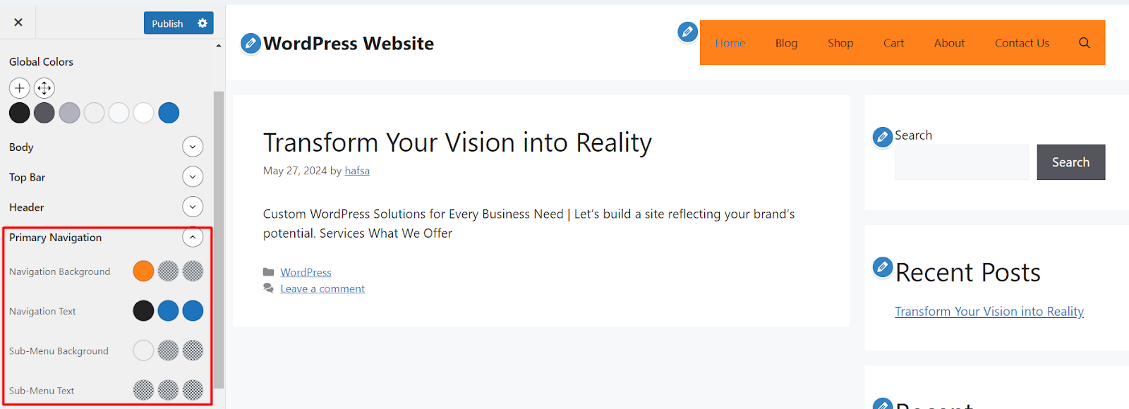
- Changing the color of a website’s navigation menu can improve user experience by enhancing visibility, readability, and aesthetic appeal. To do so, go to the “Colors” ➡ “Primary Navigation”
- Here you can see the color pallets of your WordPress site menu bar. You can simply adjust the colors of the background, the text of the primary menu, and the sub-menu items as per your brand identity.
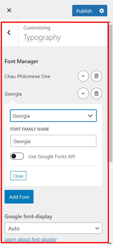
- You can also customize the font family and style of the WordPress menu. Go to the “Typography” settings, then select the preferred font family such as Times New Roman, Arial, Georgia, etc.
- As you make adjustments in the styles of the navigation menu, use the live preview feature to see how your menu will look on your site in real-time.
- Once you’re satisfied with your menu’s appearance, click the “Publish” button to apply the changes to your website.
Pros:
- Easy to use for beginners
- No coding required
- Quick to implement
Cons:
- Limited customization options
- May not match specific design goals
- Only works with classic themes
Method 2: Utilizing Full-Site Editor for Block Themes
Block themes, introduced in WordPress 5.9, offer a more flexible and powerful approach to website creation. If you’re using a WordPress block theme, you can utilize the Gutenberg full-site editor(FSE) to achieve a high degree of customization for your menu.
Here’s how to style your menu in WordPress using the WordPress full-site editor:
- From your WordPress dashboard, go to “Appearance” and select “Themes”. Activate a block-based theme that supports full-site editing e.g. Twenty Twenty-four.
- Once the block theme is activated, navigate to “Appearance” and choose “Editor”. This will open the full-site editor interface. Next, click on “Navigation”.

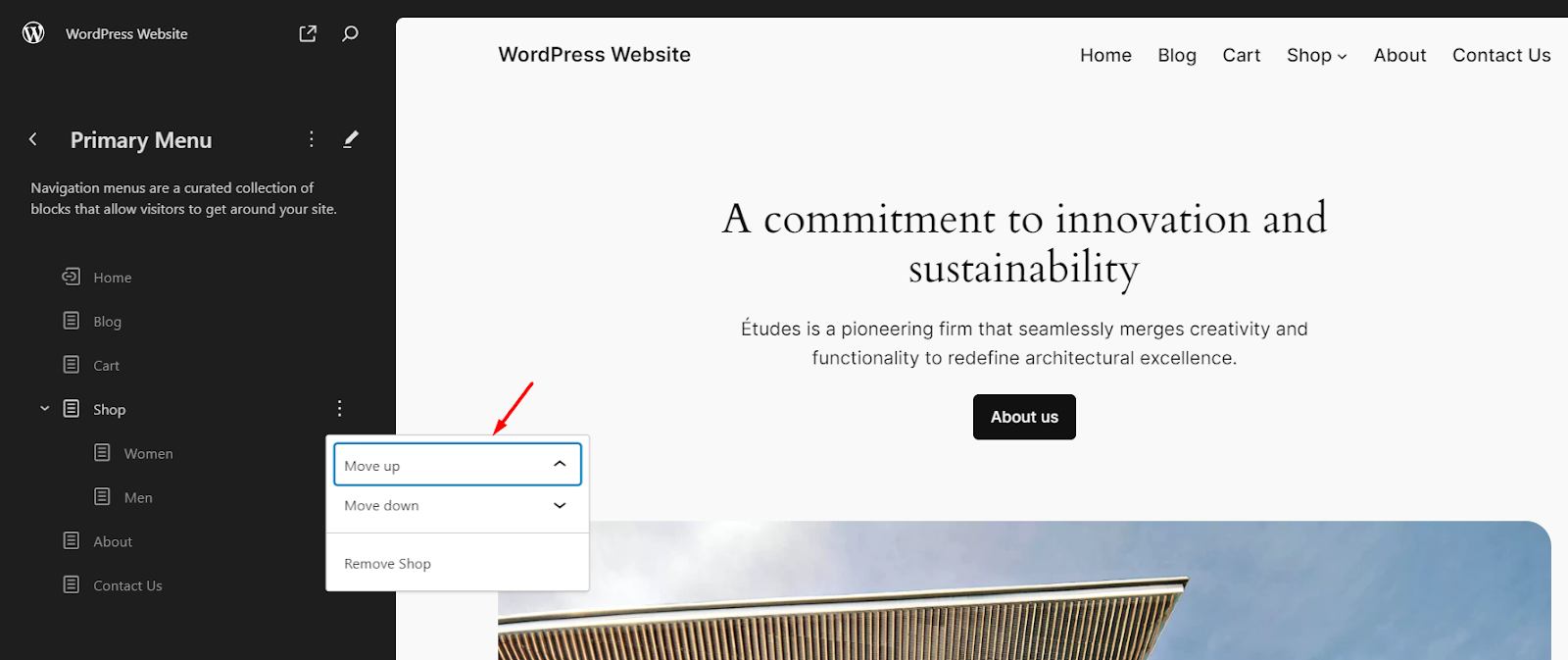
- Here, you’ll find the located menu block within the editor. You can move up/down any menu items. Also, rename their names by clicking on the three-dot option.
- Add new sub-menu items or swap one inside another to create a drop-down menu.
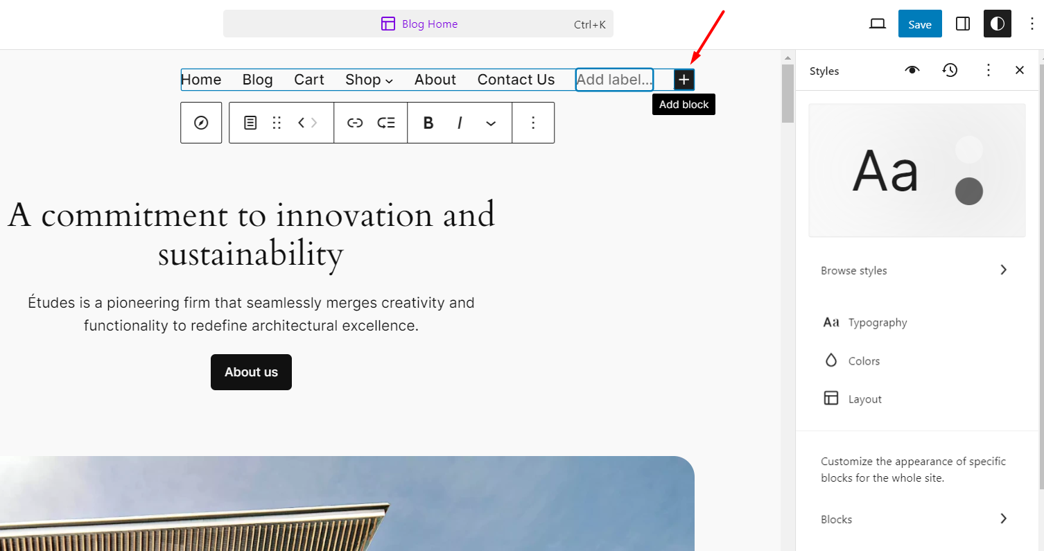
- You can add new menu items by selecting the header section or the area where your menu is displayed. It’ll show a plus (+) sign to add a new page/post/category in the navigation bar.
- Click on the nav menu block to access its settings on the right sidebar. From there, you can adjust various styling options such as colors, typography, spacing, and more using the block editor’s intuitive controls.
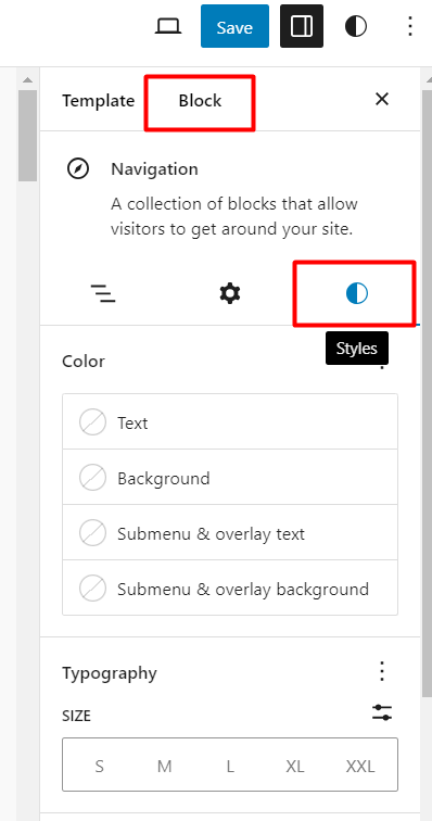
- To style the menu in the WordPress block editor or Gutenberg, go to the “Block” ➡ “Styles” tab.
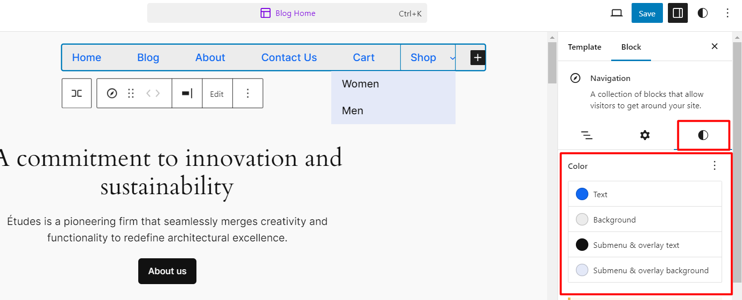
- Here you can customize the color of text, background, submenu text, and their overly background.
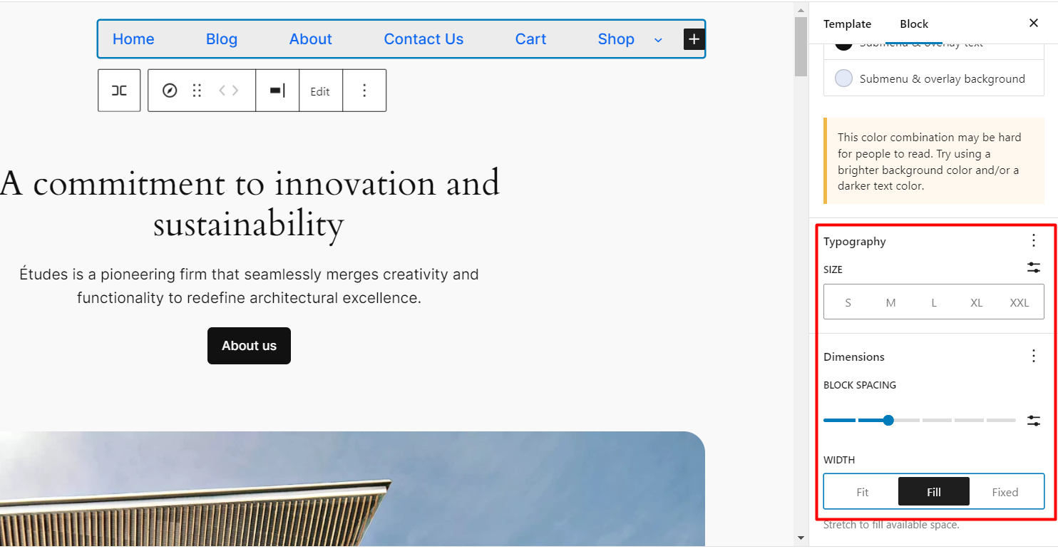
- Scroll down to adjust the font size of the nav menu items. Also, you can increase or decrease the gap between 2 items. Set the width as fit, fill, or fixed.
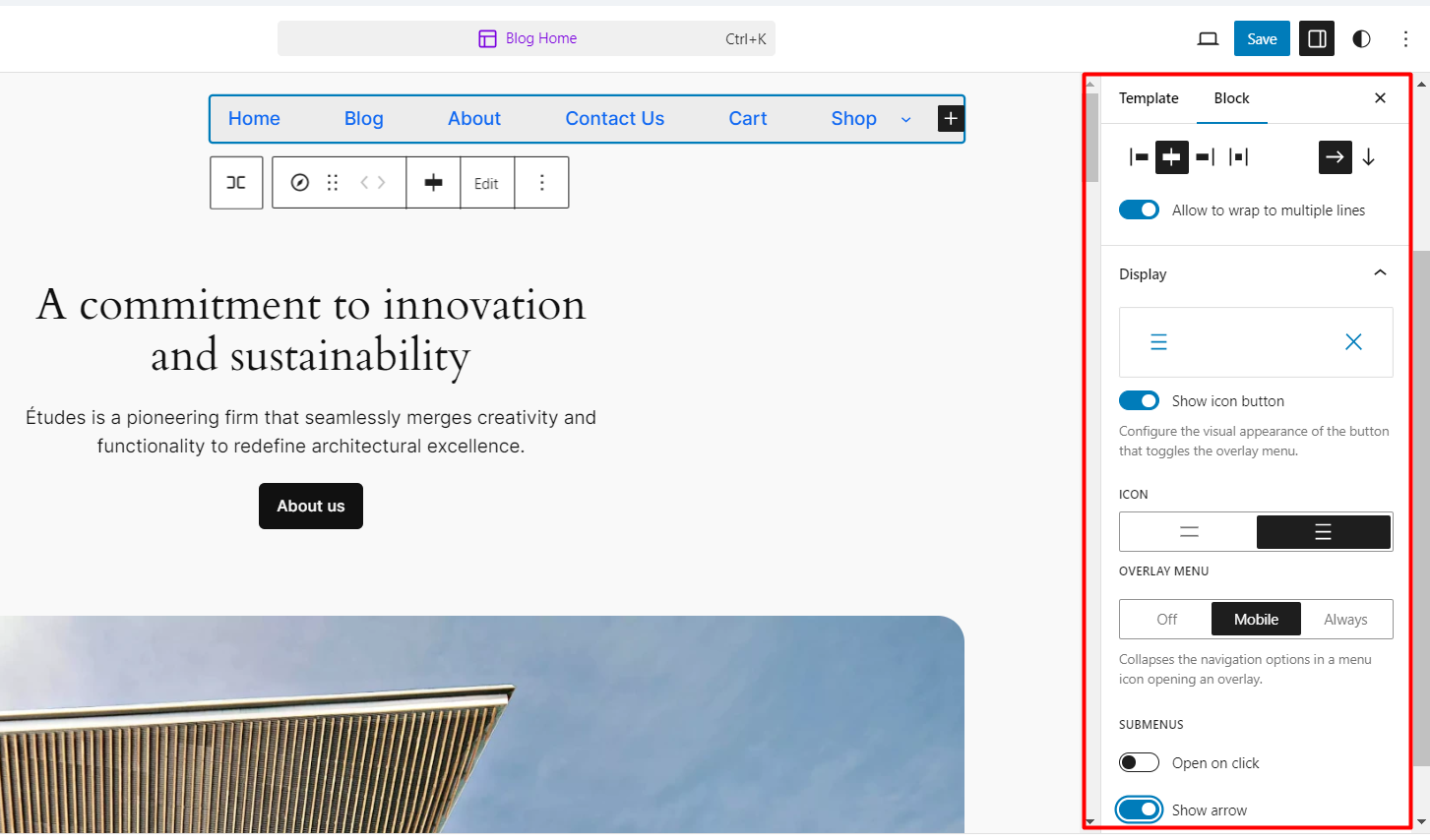
- Next, click on block “Settings” to customize the layouts, and mobile menu display options.
- You can adjust the WordPress site menu bar alignment such as left, right, justify, center, etc. Also, you can set the nav bar horizontally or vertically.
- For mobile devices, select the icon (2 or 3 bars), enable it for all devices, mobile, or keep it off. Also, enable/disable the arrow icon with the drawdown menu or open it when the user clicks on it.
- These are the entire navigation menu styling settings. You can customize the properties of single menu items. Select the specific menu item e.g. Cart. Go to the “Styles” option.
- You can add an arrow (as shown in the screenshot below) or keep it default. Also, adjust the the width as well as font size to small (S), Medium (M), Large(L), Extra Large (XL), etc to highlight the specific menu item.
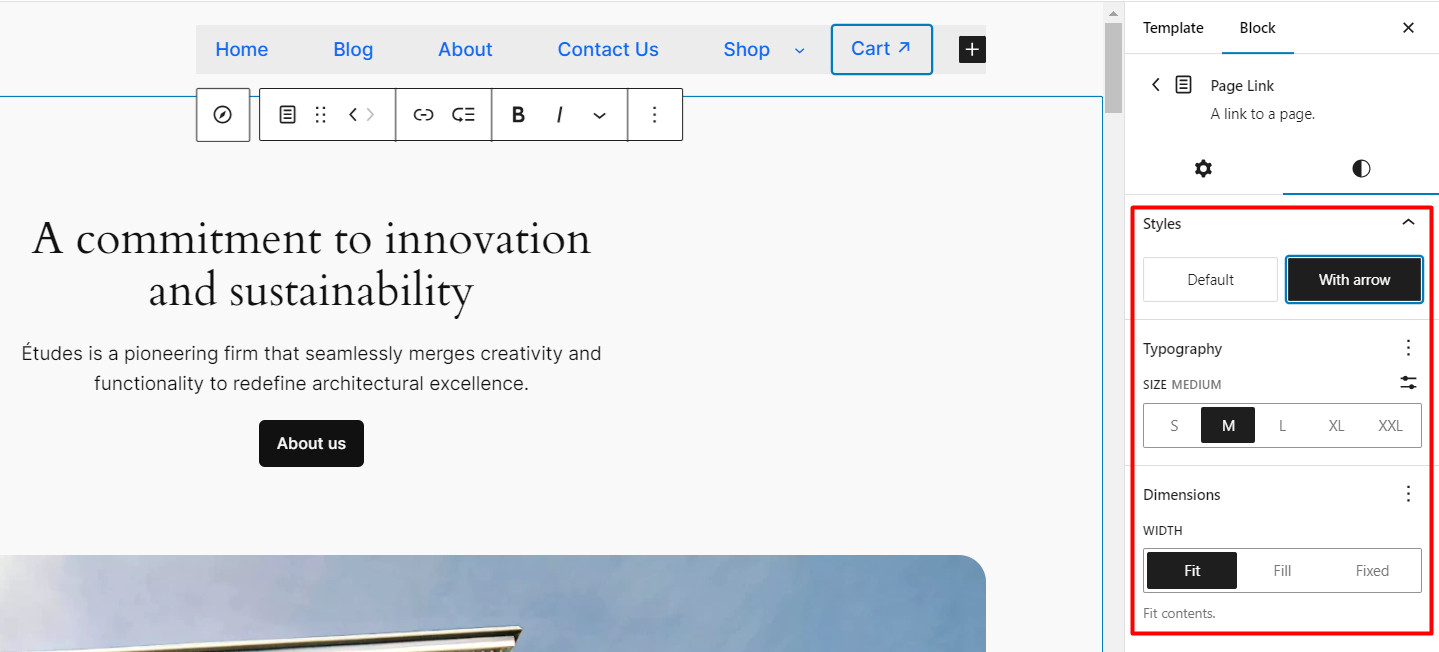
- Preview your changes to ensure they look as desired. Once satisfied, click “Save” to make your customized menu live on your site.
Pros:
- Unmatched level of customization compared to the theme customizer
- Intuitive interface with block-based editing
- Live preview for real-time feedback
Cons:
- Requires a block theme (not compatible with classic themes)
- Might have a steeper learning curve for beginners
Method 3: Using a WordPress Block Plugin (Recommended)
Styling menus in WordPress, whether using classic or block themes, is relatively straightforward but comes with certain limitations. For instance, adding images, icons, drop-downs, or creating a mega menu for an online store can be challenging with these methods. To overcome these limitations and achieve advanced menu customization, there’s a reliable solution.
You can enhance your WordPress menus using the GutenKit page builder plugin for Gutenberg.
With its powerful nav menu feature, you can create stunning and intuitive menu bars in just a few minutes. Let’s learn how GutenKit can transform your menu design experience.
- Go to your WordPress dashboard. Navigate to “Plugins” ➡ “Add New Plugin”. Search for the “GutenKit” plugin. Install and activate it.
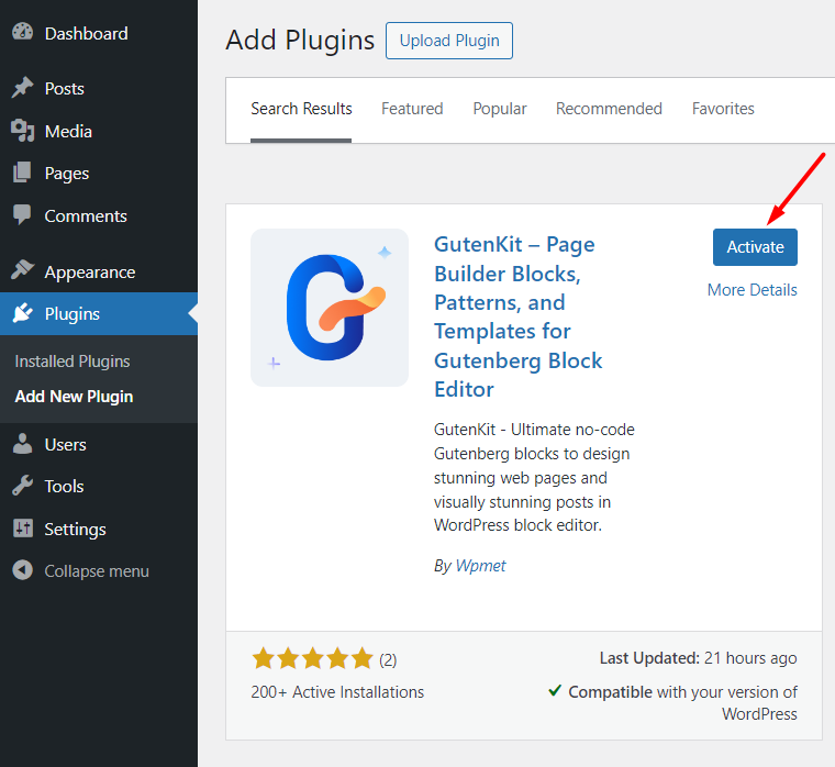
- Or, simply download GutenKit from org and then get the premium version to get the mega menu functionalities.
- After activating the plugin (free and pro), go to the Gutenberg blocks. Enable the “Nav Menu” toggle.
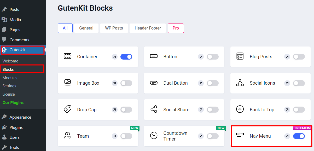
- Go to the Gutenberg editor of your WordPress site. Insert a new block for the navigation menu. Search for GutenKit’s “Nav Menu” block.
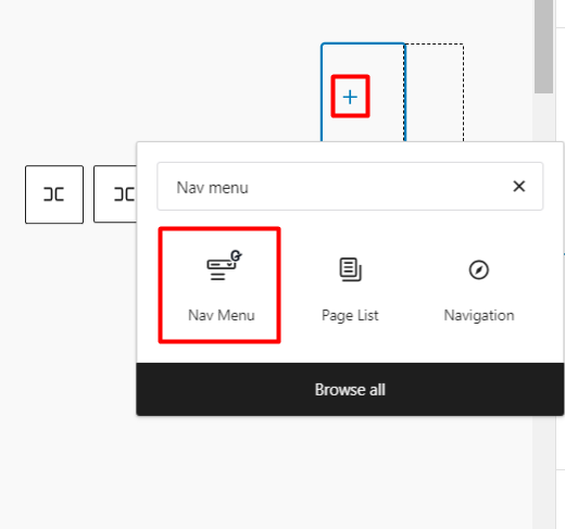
- Simply add menu items by clicking on the plus (+) icon.
- To add a submenu, especially useful for WooCommerce websites, and IT service websites, click on the “Add Submenu” icon. Then simply include submenu items by using the “Add Menu Item” option. Similarly, you can add sub-submenu for the submenu items as well.
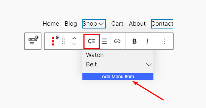
- This is the simple drop-down nav menu style. To create a mega menu on your WordPress site, click on the “Add Mega Menu” option of the nav bar block.
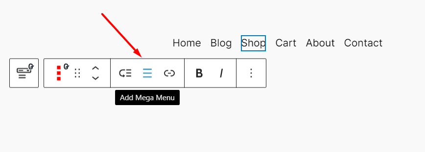
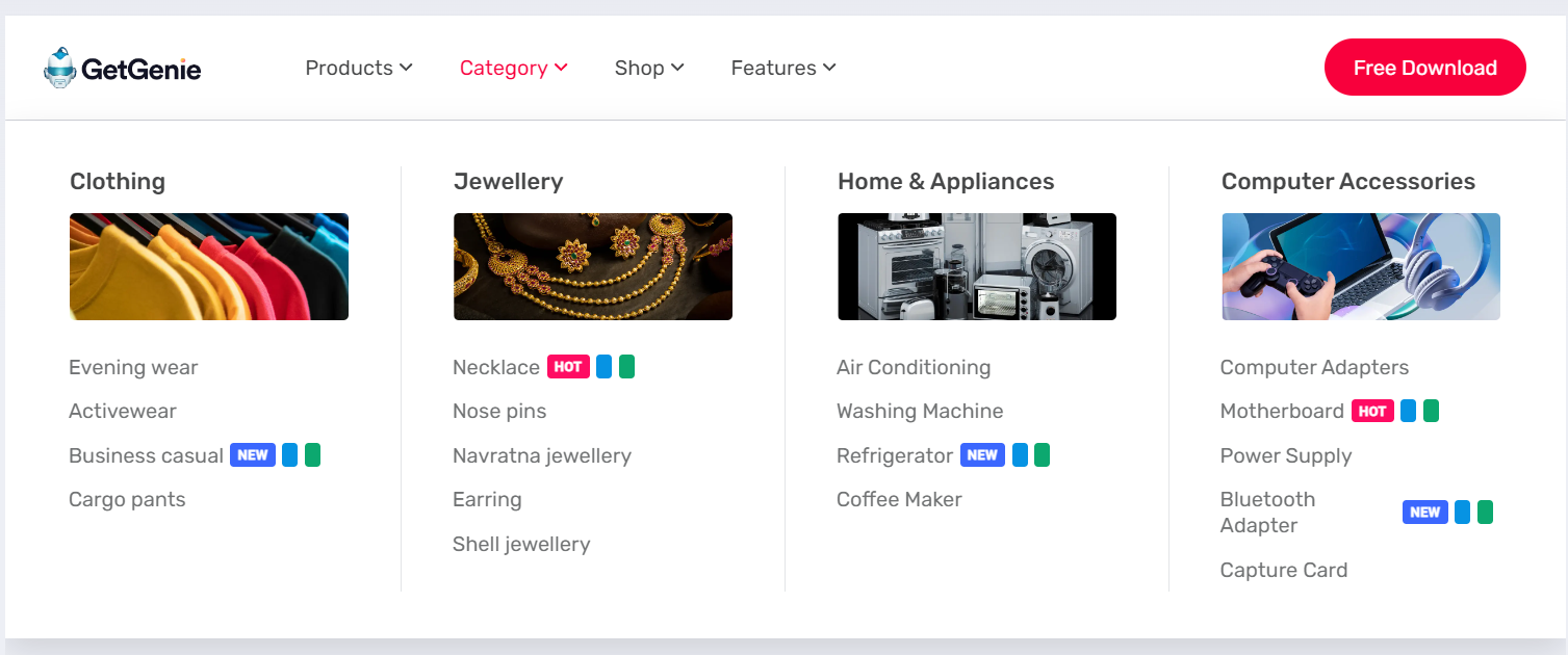
- Now, you can insert any of the Gutenberg and GutenKit blocks here as a menu item of your WordPress site. For instance, you can add images, icons, buttons, and many more. Once you click/hover over a menu item, it will show other elements of the mega menu of your website.
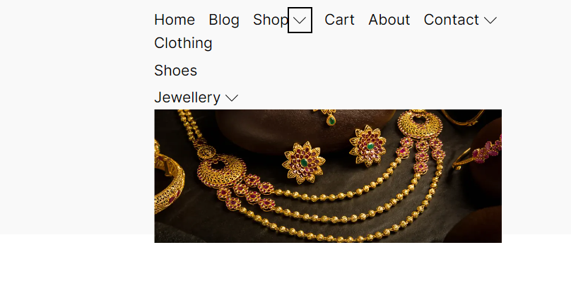
Now, it’s time to explore the customization options for the menu bar. On the right sidebar, you’ll find extensive customization settings for WordPress menu bar content, style, and advanced styling.
WordPress Menu Content Customization:
Let’s start with the content customization options of GutenKit. You can add menu breakpoints for tablet, mobile, or even custom settings. Also, justify the menu content and items alignment such as left, right, center, or justified.
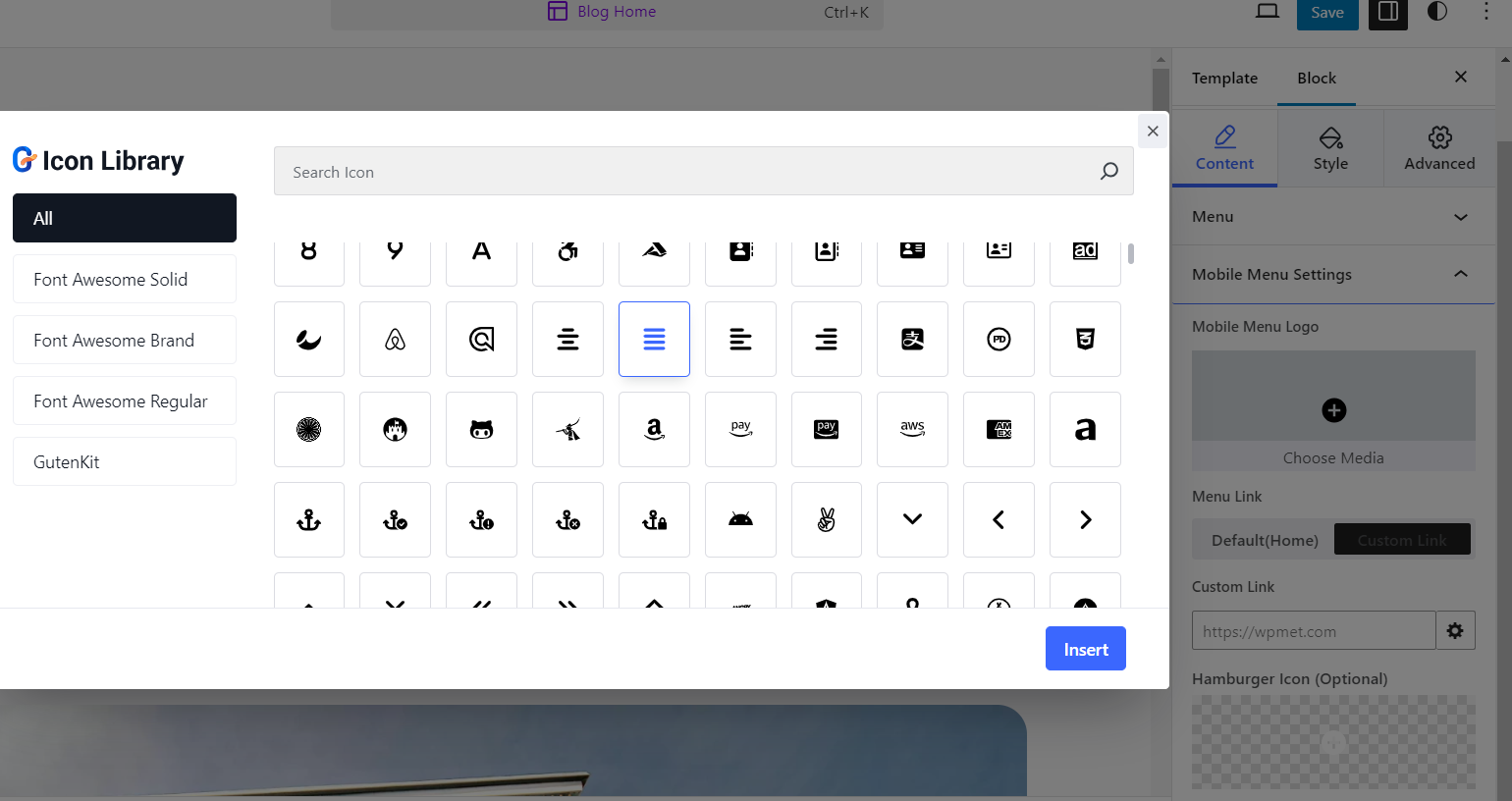
For mobile devices, you can add different logos and custom links. GutenKit also offers a built-in icon library (900+ icons) with the fastest loading time. You can utilize them and add the hamburger icon for the mobile navigation menu.
WordPress Menu Style Customization:
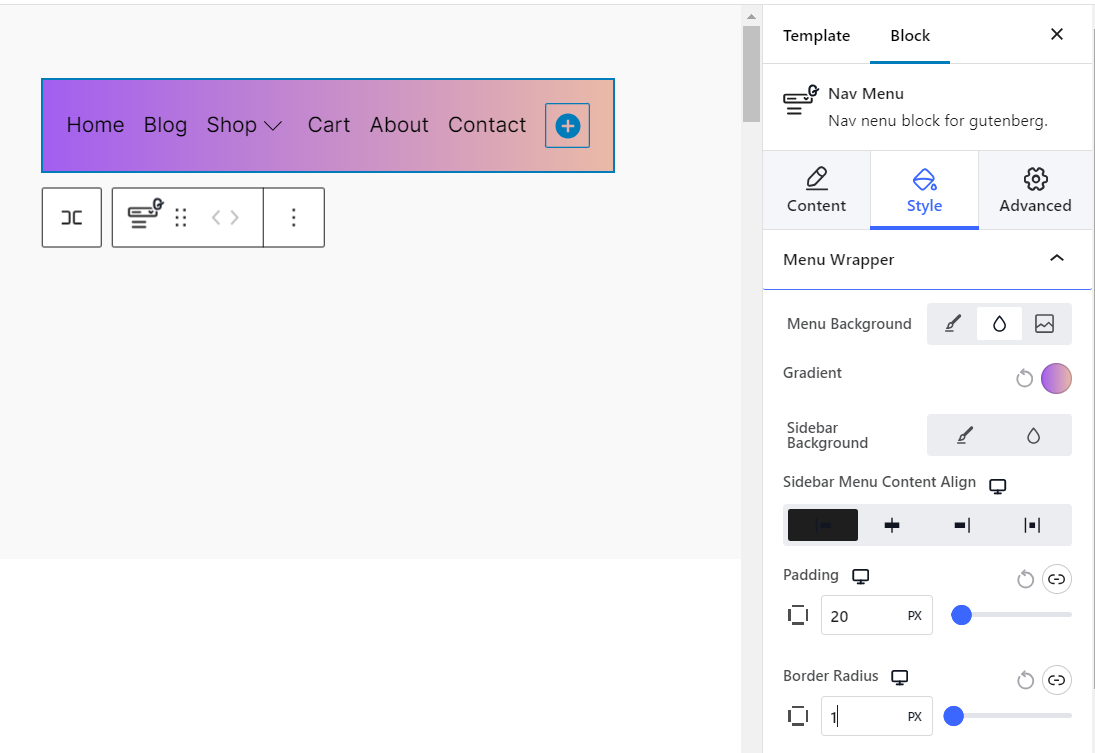
The main advantage of using the GutenKit’s nav menu block is its tons of style customization options. You can add solid color as the background of your nav menu. Or, make the nav menu more appealing using gradient colors or custom images.
Also, you can adjust the content alignment, padding, and border radius to make a perfect balance with the landing page.
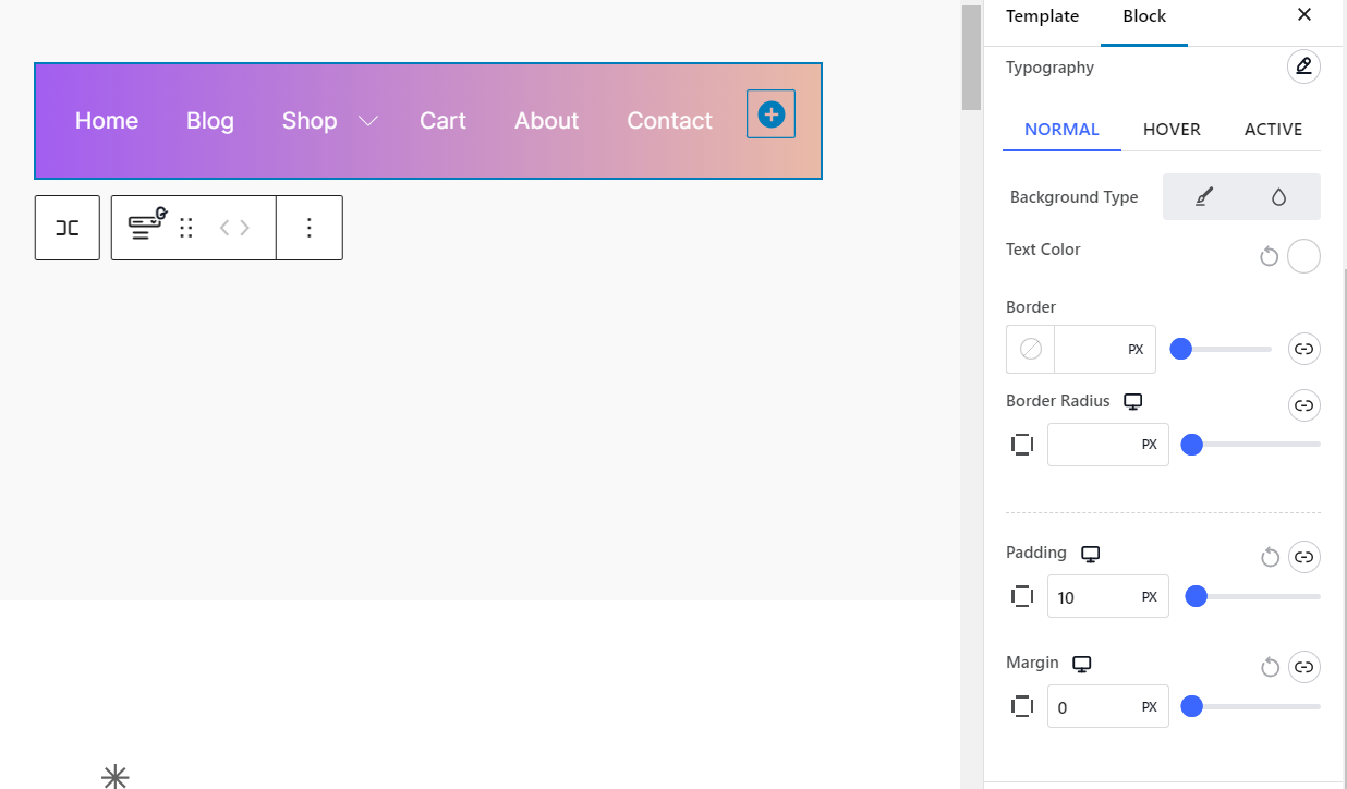
- For individual menu items, set the text color as per your menu background color contrast. Add padding, margin, and border to add more depth to your WordPress website navigation menu.
WordPress Menu Advanced Customization:
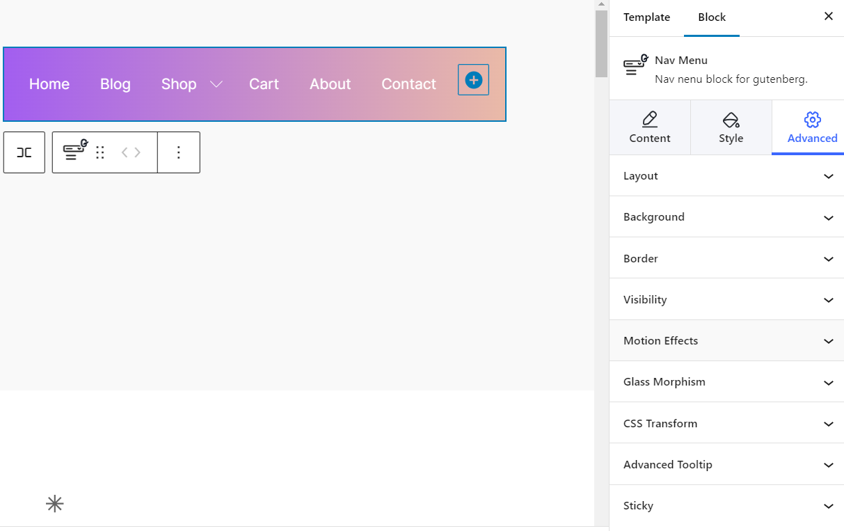
- In GutenKit, you’ll get advanced customization global modules. Here you can style the entire nav menu, background, border, etc. Also, you can show/hide the visibility according to devices such as PC, tab, and mobile.
- You can also utilize the motion effects, glass morphism effects, and advanced tooltip options. With the sticky setting, you can make the WordPress menu stick on the website’s top, and bottom or keep it sticky during even scrolling.
- Use the block editor’s live preview feature to see how your menu looks as you adjust. This allows for real-time feedback on your design changes.
- Once satisfied with the menu’s appearance, “Save” your changes and publish the page. Your customized menu will now be visible on your site.
Here is a demo design of the mega menu using GutenKit’s nav menu block.
Check out this step-by-step video to learn more about adding a mega menu in WordPress 👇
Pros:
- Powerful customization options for a cohesive look
- Create mega menus with advanced layouts
- Seamless integration with Gutenberg editor
Cons:
- May have a learning curve for beginners
- Not compatible with classic themes
Best Practices for WordPress Menu Design
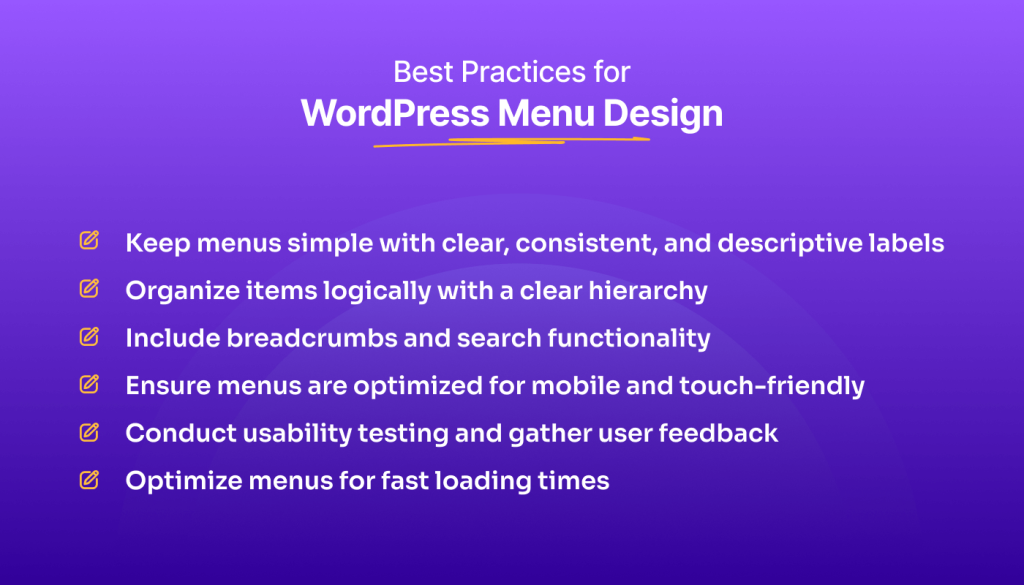
A well-designed WordPress menu is more than just aesthetics! intuitive and user-friendly navigation menu helps keep your visitors engaged and coming back for more.
Here are key practices to keep your menu in tip-top shape:
- Keep it Simple: Use clear, consistent, and descriptive labels for menu items to ensure easy navigation for users.
- Order Logically: Arrange menu items logically, following a clear hierarchy that reflects the structure of your website’s content.
- Include Breadcrumbs and Search: Include breadcrumbs to help users understand their current location within your site. Additionally, integrate search functionality to assist users in finding specific content quickly.
- Optimize for Mobile: Ensure menus are optimized for mobile devices and touch interactions. Use responsive design techniques to make menus easy to use on smaller screens.
- Test Usability: Conduct usability testing to identify any usability issues with your menu design. Gather feedback from users to understand their navigation preferences and improve the user experience.
- Optimize for Speed: Optimize menus for fast loading times by minimizing unnecessary elements and optimizing images and code. A speedy menu enhances user experience and improves overall site performance.
Frequently Asked Questions (FAQ)
Can I have multiple menus on my WordPress site?
Yes, WordPress allows you to create and assign multiple menus to different locations on your site, offering flexibility in navigation customization.
What should I consider when designing a mobile-friendly menu?
When designing a mobile-friendly menu, prioritize simplicity, clear labeling, and responsive design to ensure easy navigation on smaller screens.
Can I use the GutenKit mega menu for free?
The GutenKit mega menu is available as a premium widget, offering advanced features for creating impressive and customizable menus.
Wrap up: Style a Menu in WordPress Effortlessly
Customizing a menu in WordPress is an essential step in enhancing your website’s usability and aesthetic appeal. Among 3 methods, using the GutenKit block plugin to style your WordPress website menu offers more flexibility and customization options.
In addition, you can enhance user satisfaction and engagement by following the given best practices.
Style your navigation menu with the GutenKit page builder block for Gutenberg to create a visually stunning and highly functional website that will keep your visitors returning again and again!
Leave a Reply